How AVAIL customers use visuals to navigate information
Read More
Finding information through endless scrolling and searching in traditional file folders and cloud storage can be overwhelming, leading to errors and wasted time. To simplify the process, we introduced Channel Cards and Key Cards.
Channel Cards act as “album covers” for each Channel you create, offering a visual way to navigate your content. Key Cards provide a way to visually group and filter content within a Channel. These visual gateways are dynamic and completely customizable through the use of your own graphics!
We launched the ‘Show Your Cards’ contest to encourage customers to share their creative uses of these features. Their entries were a testament to the power of visual navigation over searching through file folders and cloud storage solutions.
See this year’s submissions below.
BEST BRAND IDENTITY
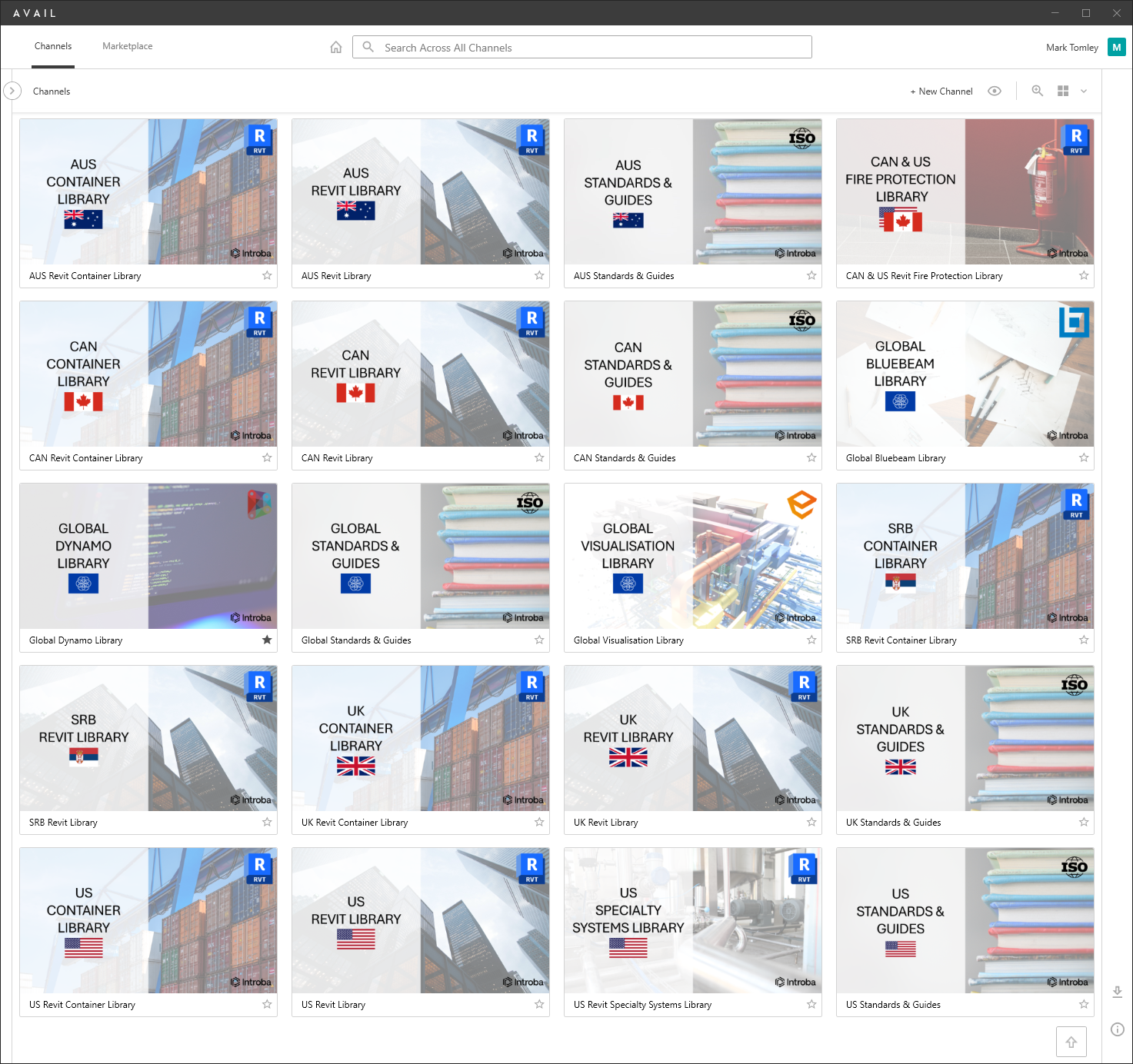
For our first category, Best Brand Identity, we asked our customers to show and tell us how they’ve incorporated their firm’s brand standards into their Key Cards and Channel Cards. The winner of this category was Introba.
Introba
“Introba is a global company with offices in Canada, the United States, Australia, Serbia, and the United Kingdom.
In developing our AVAIL brand identity, we realised we needed separate channels for each region and shared global content. These channels had to have a consistent, recognisable identity and be visually appealing. The addition of the region’s flags and application logos allows all Introba users, regardless of their native language, to instantly recognise relevant channels.
To ensure we can readily update channel images, the Introba AVAIL template has been created in Microsoft PowerPoint, which all Introba staff have access to.”
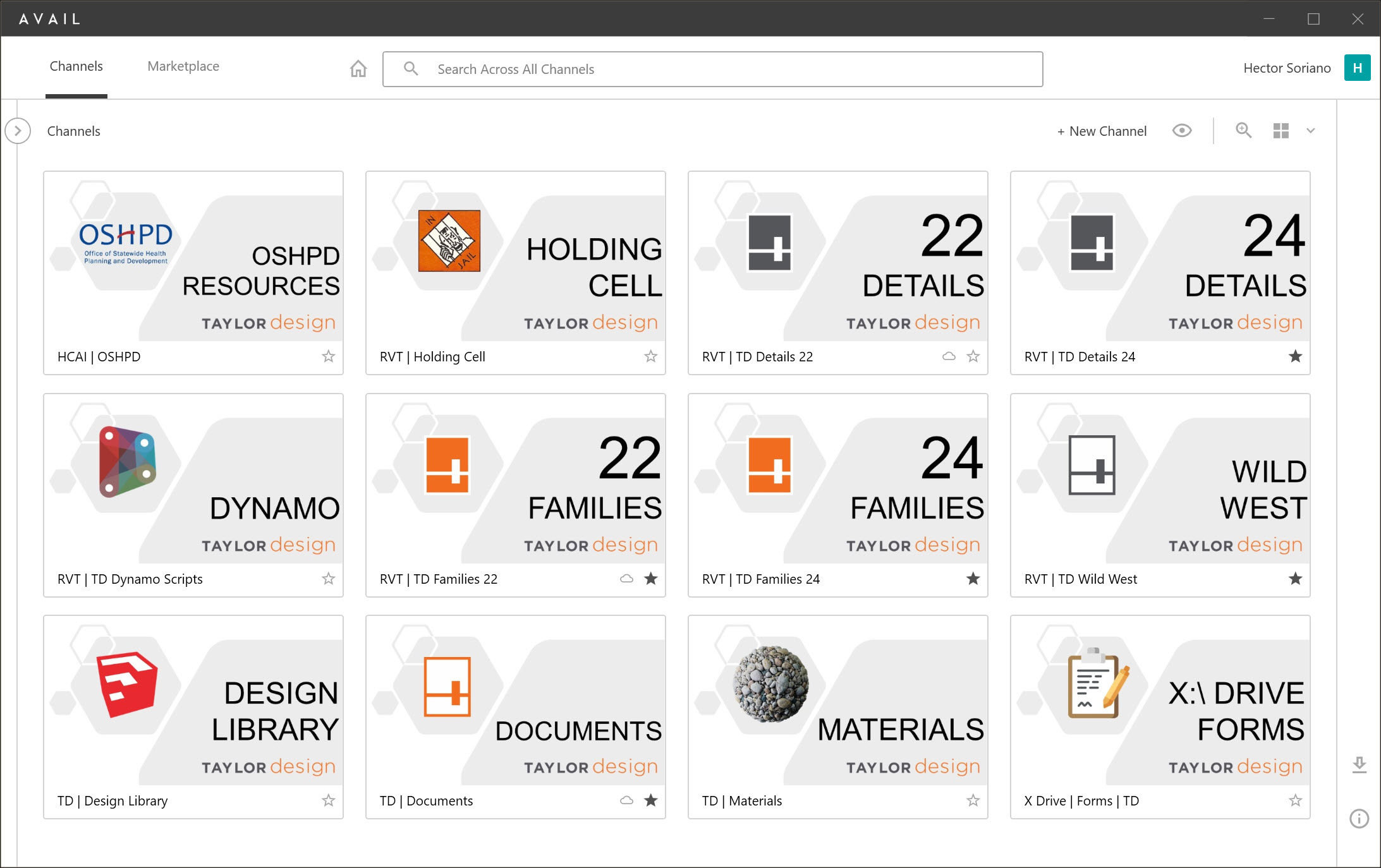
Taylor Design
“At Taylor Design, we’re all about making things easy. The visual magic of AVAIL’s Channel Cards has transformed how we navigate content, providing a reliable roadmap for effortless exploration. We appreciate how a well-designed visual touch simplifies navigation and brings a sense of satisfaction to content discovery.”
BEST VISUAL NAVIGATION
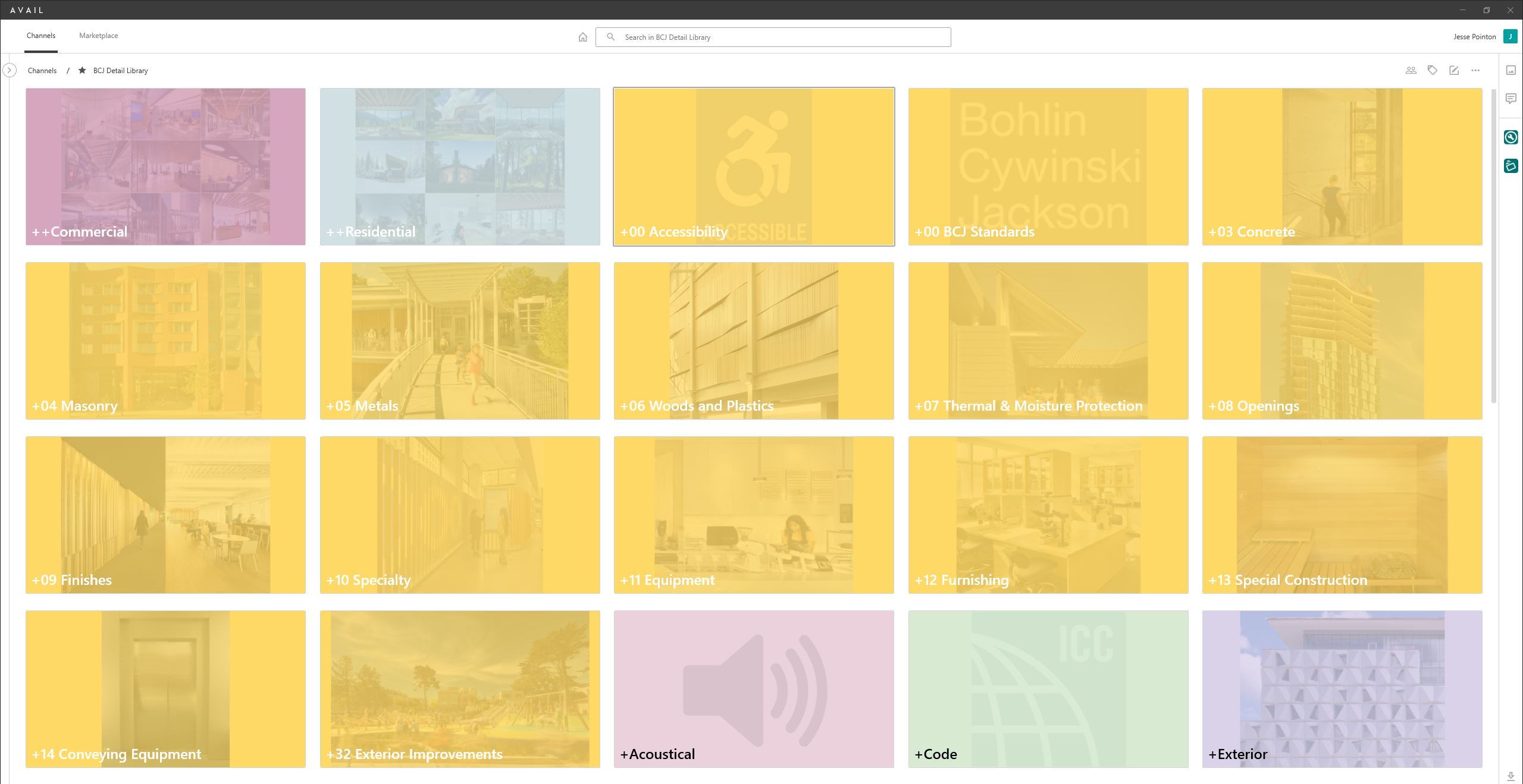
For our second category, Best Brand Visual Navigation, we asked our customers to show and tell us how they use Key Card and Channel Card graphics to improve navigating information. The winner of this category was Bohlin Cywinski Jackson.
Bohlin Cywinski Jackson
“Bohlin Cywinski Jackson has created a cohesive set of keycards mainly organized around CSI spec section as well as other major headings such as Commercial, Residential, Code, Acoustics, etc.“
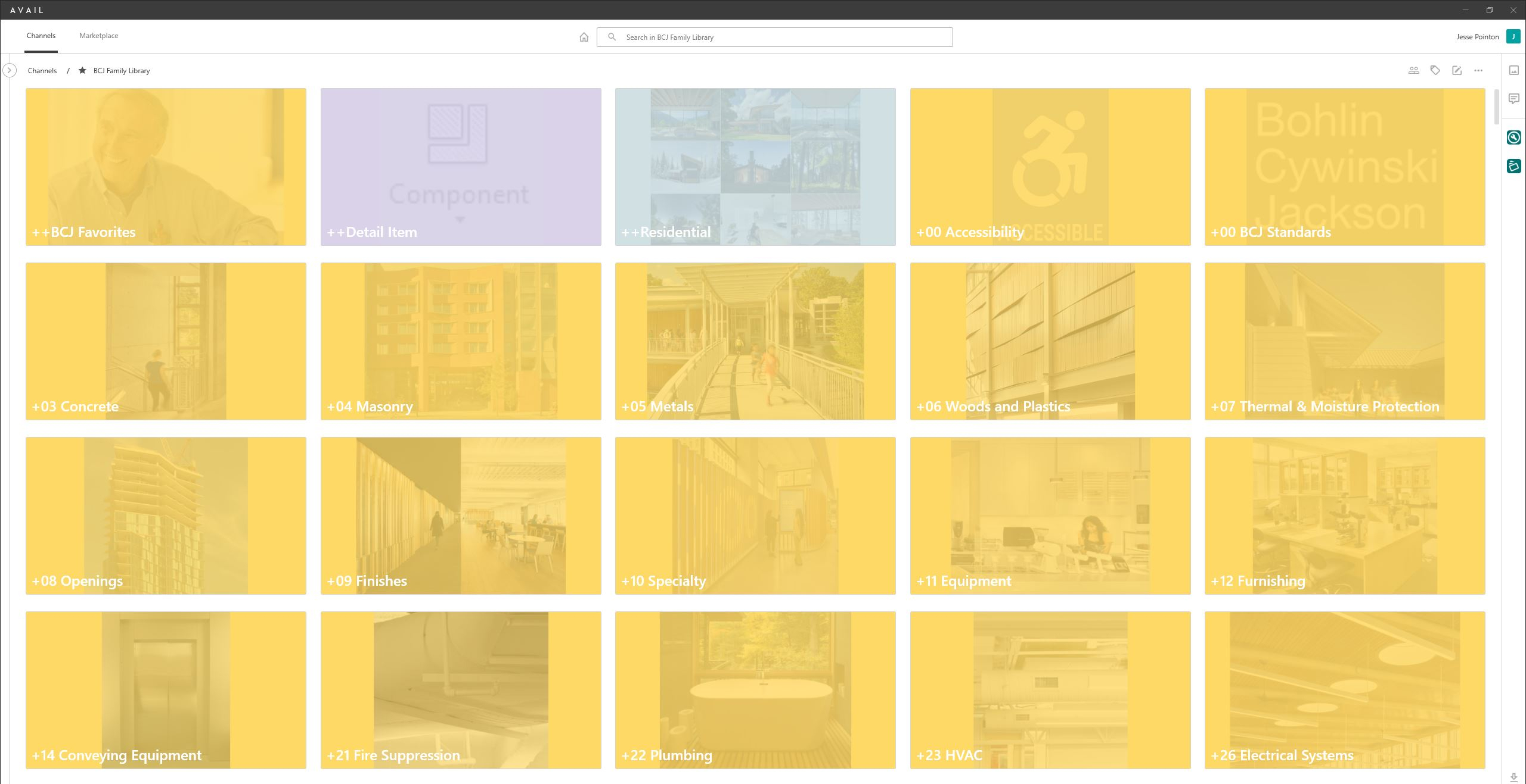
Bohlin Cywinski Jackson
“Bohlin Cywinski Jackson has created a cohesive set of keycards across our detail and family libraries mainly organized around CSI spec section as well as other major headings such as Commercial, Residential, Code, Acoustics, etc.“
Gray AE
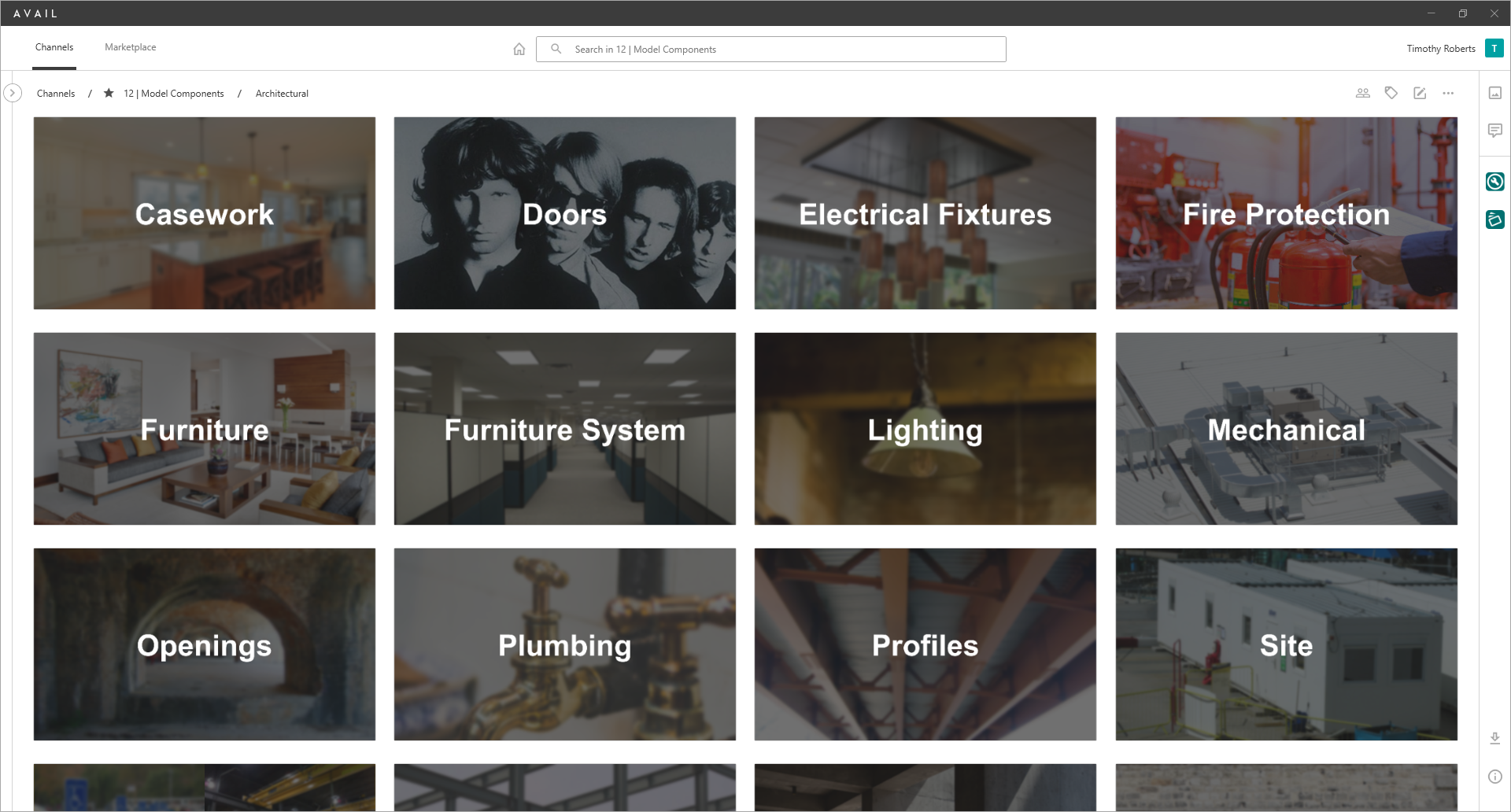
“When creating the keycards I wanted them to be simple, easy to read, and throw in an “Easter egg” to see if anyone catches it. Our Channel 12 has the most obvious “Easter egg” and I’ve added some in other channels. It’s a fun way to keep people engaged and checking for updates.”
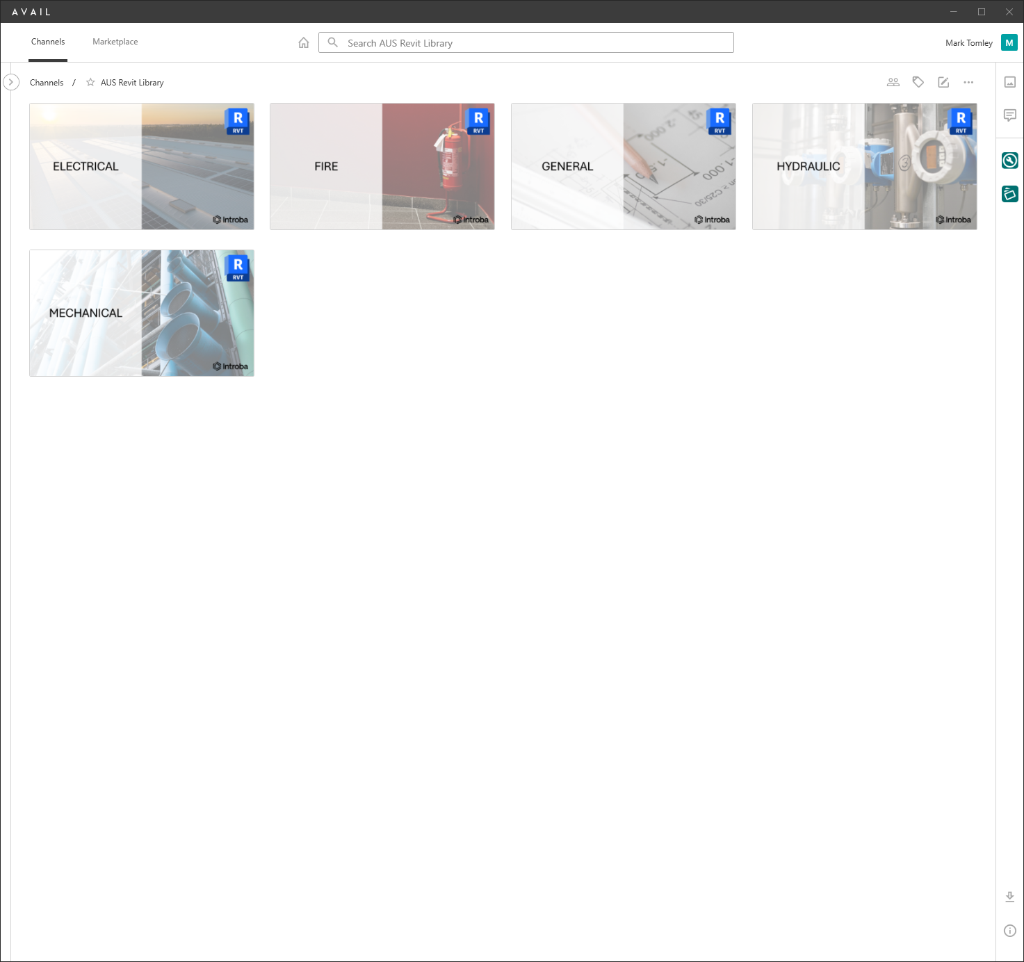
Introba
“Introba is a global company with offices in Canada, the United States, Australia, Serbia, and the United Kingdom.
In developing our AVAIL brand identity, we realised we needed consistent, recognisable and visually appealing Key Cards. The addition of discipline specific images and application logos allows all Introba users, regardless of their native language, to instantly recognise relevant disciplines.
To ensure we can readily update channel images, the Introba AVAIL template has been created in Microsoft PowerPoint, which all Introba staff have access to.”
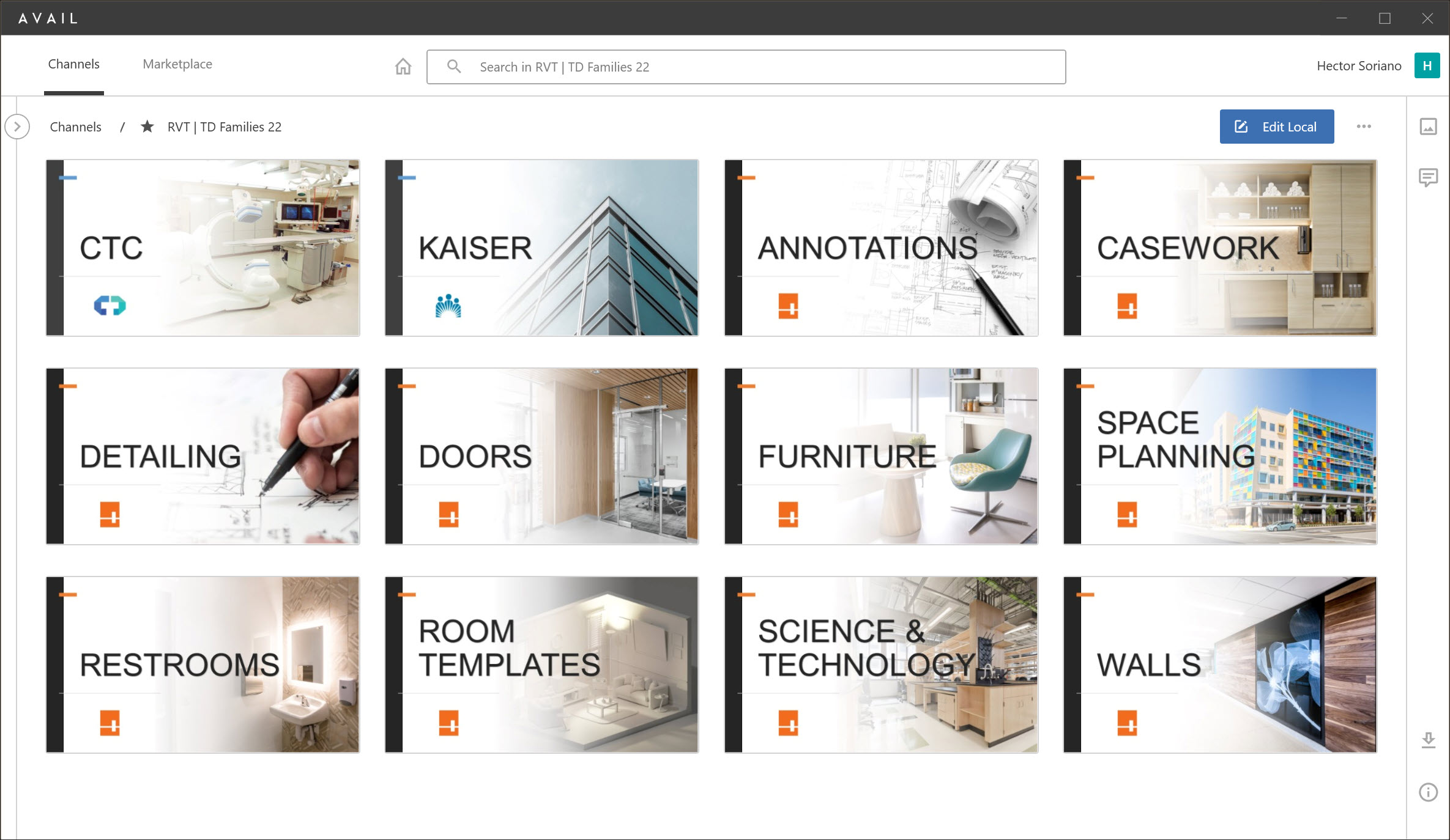
Taylor Design
“Keycards have revolutionized content navigation at Taylor Design. Realistic images not only add authenticity but also offer an easy way to identify keywords. Small logos for content sources are included, and we ensured that titles are easily readable for a smooth user experience.”
MOST CREATIVE
For our last category, we asked our customers to show and tell us some creative things that they’re doing with Key Cards and Channel Cards. The winner of this category was Taylor Design.
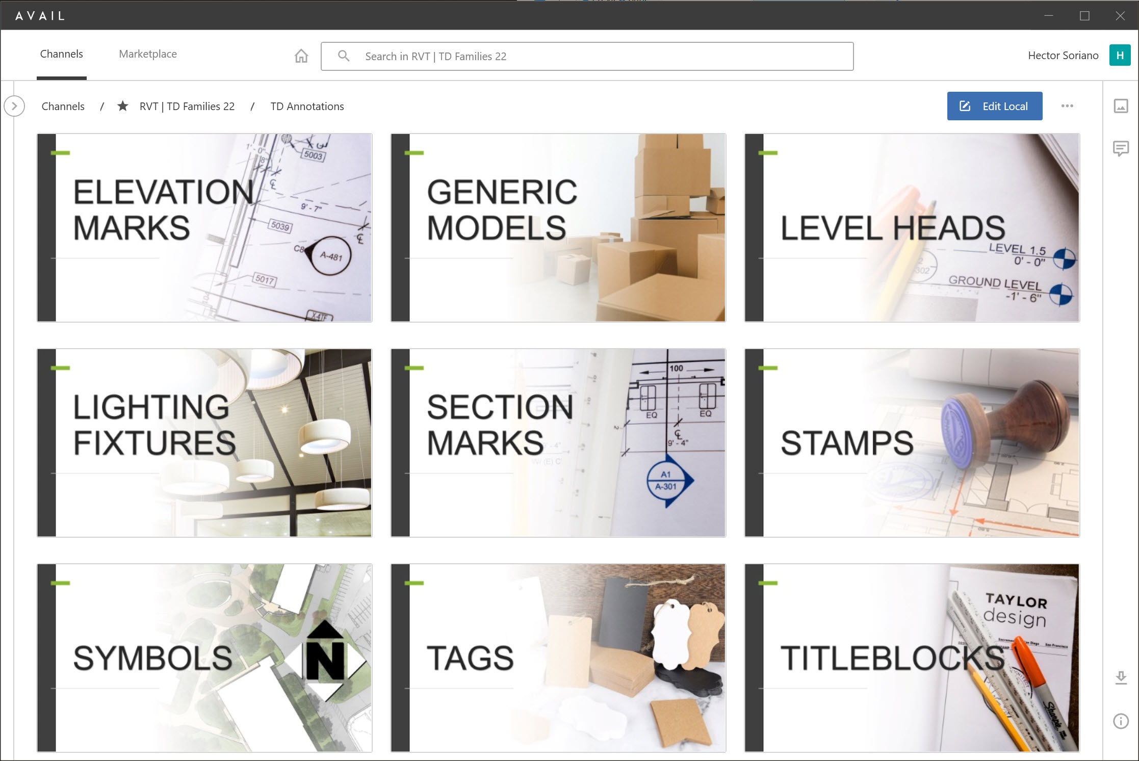
Taylor Design
“Crafting realistic images to convey filtered categories using Keycards at Taylor Design was no easy task, especially when handling content in the annotations category. Striking the right balance between authenticity and clarity posed a challenge, but we believe we successfully overcame it.”
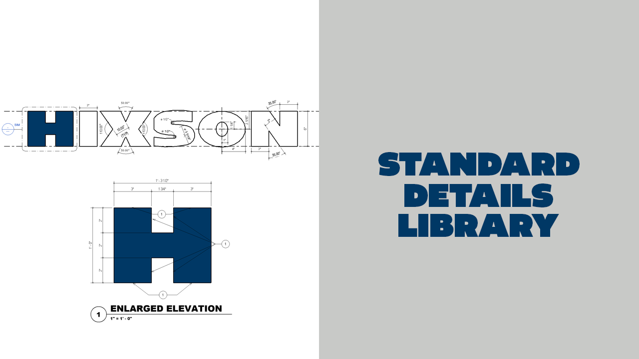
Hixson Architecture, Engineering and Interiors
“This keycard is used for our company standard details library. Our company logo is being dimensioned with an enlarged elevation of the Hixson ‘H’ further being detailed, dimensioned and keynoted.”
Need a Key Card refresh?
The AVAIL content management system enables project teams and enterprises to better find, organize, and manage all of their digital assets. AVAIL is designed to work with your existing file storage systems including cloud-hosted content in solutions such as OneDrive and Autodesk BIM360! With AVAIL’s focus on visuals, information navigation in the AEC industry has never been easier.
AVAIL’s Channel Card and Key Card features provide visual gateways to your content that help you find the right content in just a few button clicks. They’re completely customizable, letting you make AVAIL feel like your own custom app.
Learn More About Key CardsUser-friendly Channel Navigation – How and Why to Use Key Cards
Creating an easy-to-navigate (and maintain) AVAIL environment is essential to a successful implementation of AVAIL. We will share examples of common ways our customers have leveraged Key Cards, tags, and visuals to make search more efficient and intuitive. Timestamps 0:00 Overview 1:59 What are Key Cards? 5:05 Why Use Key Cards?
In this webinar, we share examples of common ways our customers have leveraged Key Cards, tags, and visuals to make search more efficient and intuitive.

