How AVAIL customers use visuals to navigate information
Read More
Finding information through endless scrolling and searching in traditional file folders and cloud storage can be overwhelming, leading to errors and wasted time. To simplify the process, we introduced Channel Cards and Key Cards.
Channel Cards act as “album covers” for each Channel you create, offering a visual way to navigate your content. Key Cards provide a way to visually group and filter content within a Channel. These visual gateways are dynamic and completely customizable through the use of your own graphics!
We launched the ‘Show Your Cards’ contest to encourage customers to share their creative uses of these features. Their entries were a testament to the power of visual navigation over searching through file folders and cloud storage solutions.
See last year’s submissions below.
BEST BRAND IDENTITY
For our first category, Best Brand Identity, we asked our customers to show and tell us how they’ve incorporated their firm’s brand standards into their Key Cards and Channel Cards. The winner of this category was /slantis.
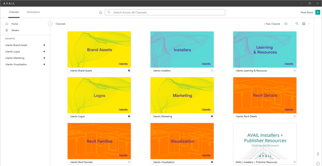
/slantis
“Here at slantis, we foster a disruptive mindset that seeks to create new things and stay ahead of the game 
Finally, we added a creative, content-aligned design for the channel to faithfully portray the merging of our passion, the team, our values, technology, and most importantly, our daily collaboration spirit!
Regarding the funky mesh, we collected data from our Slack channels, filtered it, got deeper insights about pj.5s, selected a generative design, personalized a code, added our color palette, and voila! 
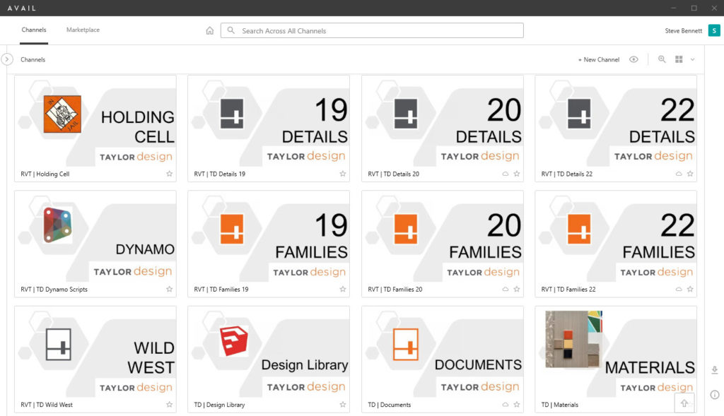
Taylor Design
“Taylor Design was an early adopter of AVAIL and we were super excited when Channel Cards were released as it allowed us to give some visual guidance in addition to the names of the channels to help guide people to the content they need. Our orange logo helps them find loadable family content, dark grey for detail views/sheets and a variety of other logos for different types of content.”
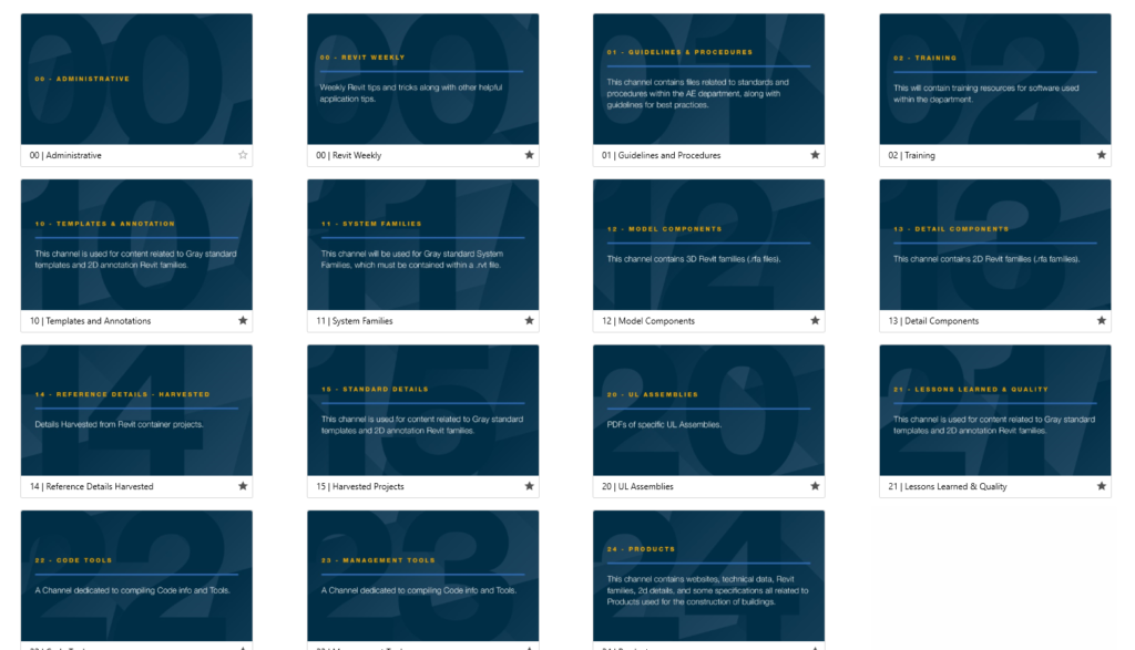
Gray AE
“We recently did a complete overhaul of the content that was in the channels. We wanted something to signify a change in the channels. Our previous channel cards were simple, with the company logo in the bottom right and the channel name in the middle. Our marketing team was able to come up with something simple and still easy to understand.”
Sheehan Nagle Hartray Architects
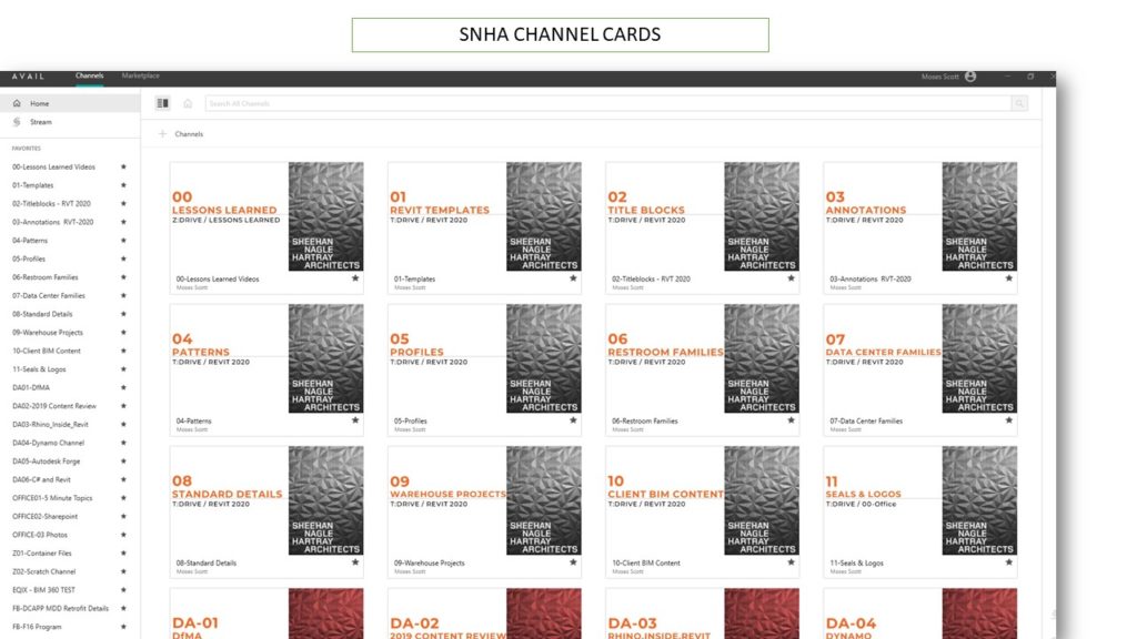
“At SNHA, we use AVAIL to index and point to our Revit content and digital assets. Avail provides us with a platform where we can access all of our content and assets, regardless of where they are stored.
We use color-coded channel cards in Avail to organize and classify our content. The cards are based on Sheehan Nagle graphic standards and standard color schemes. We use black channel cards for Revit content, red channel cards for scripting, and blue channel cards for project-specific content. This allows us to easily identify the type of content we are looking at, and also helps us to keep our content organized and well-structured.
In addition to indexing and pointing to content, Avail also allows us to set up permissions and access controls to ensure that only authorized users can access certain content. Overall, AVAIL is an essential tool for us at SNHA, helping us to efficiently access and organize our Revit content and digital assets, and maintain the security and integrity of our content.”
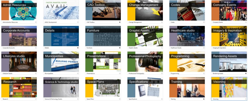
Hendy
- Blue – Production assets
- Green – Marking, Graphic assets, Project photography
- Yellow – Programming, Visioning, Research
- Orange – Administrative
- Purple – Corporate Accounts
The colors chosen are colors we use on all of our project proposals, block plans for clients and in-house presentations. We’re especially excited about the Company Events Channel where anyone can look back on all the amazing Hendy parties and industry events. It will be a true record of our culture of hard work, design excellence and family-style culture.”
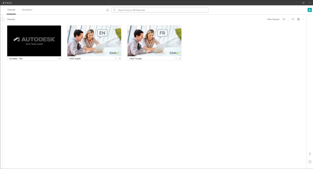
CIMA +
“We designed the graphics for the Channel Cards with the company colors in mind as well as adding the company logo. We also stated whether it’s English or French so the user can easily navigate to their preferred language.”
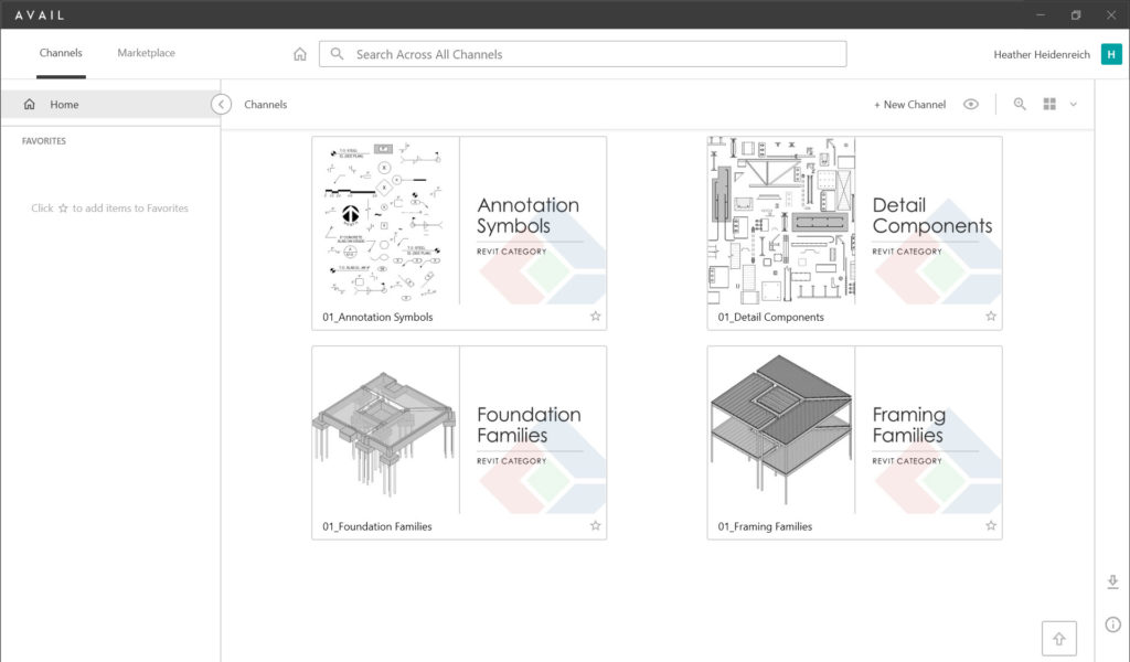
IMEG
“With the simplicity of a diamond shape and its colors, our logo creates a strong presence. We found layering it in as a watermark, a great way to give immediate branding. And then to have a bit of whimsy for our structural families, we modeled framing and foundations to match the logo’s shape. The end result is quite striking!”
BEST VISUAL NAVIGATION
For our second category, Best Brand Visual Navigation, we asked our customers to show and tell us how they use Key Card and Channel Card graphics to improve navigating information. The winner of this category was Taylor Design.
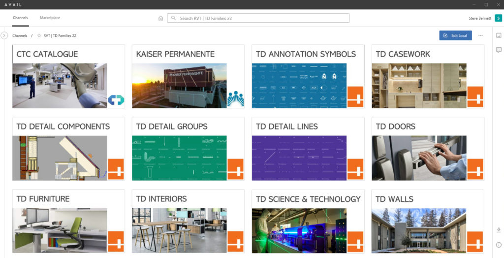
Taylor Design
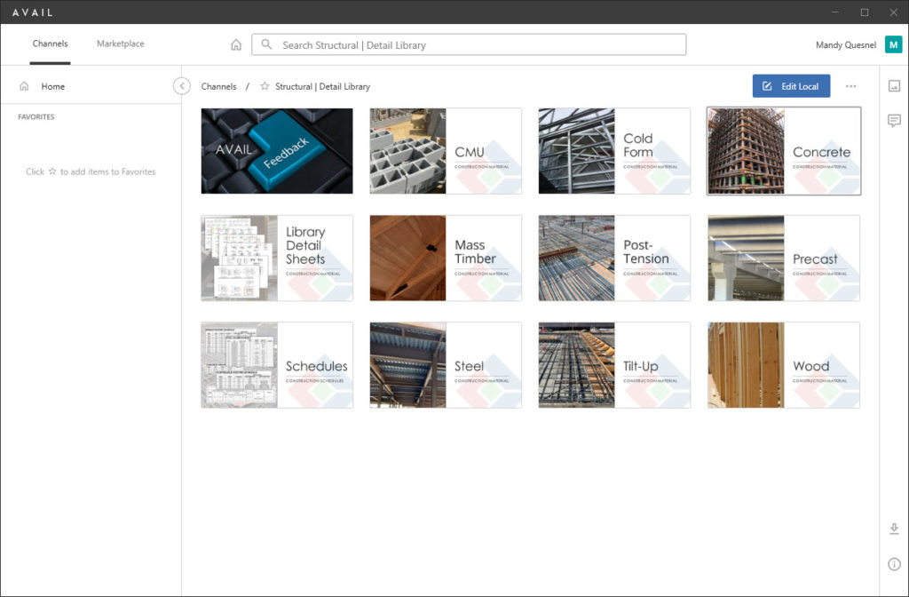
“Within channels, Taylor Design has employed a few features to help people dive quickly into other content we’ve categorized. Logos in the bottom right corner help identify the source of the content, images convey the general content and for 2D line-based families such as annotations we went for a throw-back style of blueprint paper.”
IMEG
“Along with our logo and a title, we have added a picture from our projects to clearly display what you will find within this Key Card.”
CIMA +
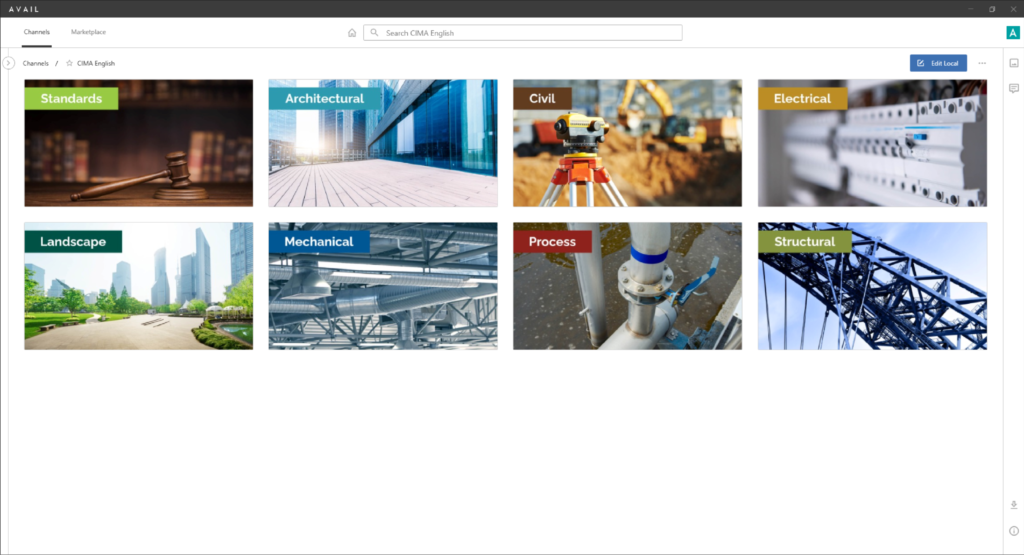
“We wanted to make finding content easier for the user by color coordinating each discipline. Under each discipline the sub-categories match the color of the corresponding discipline.”
CIMA +
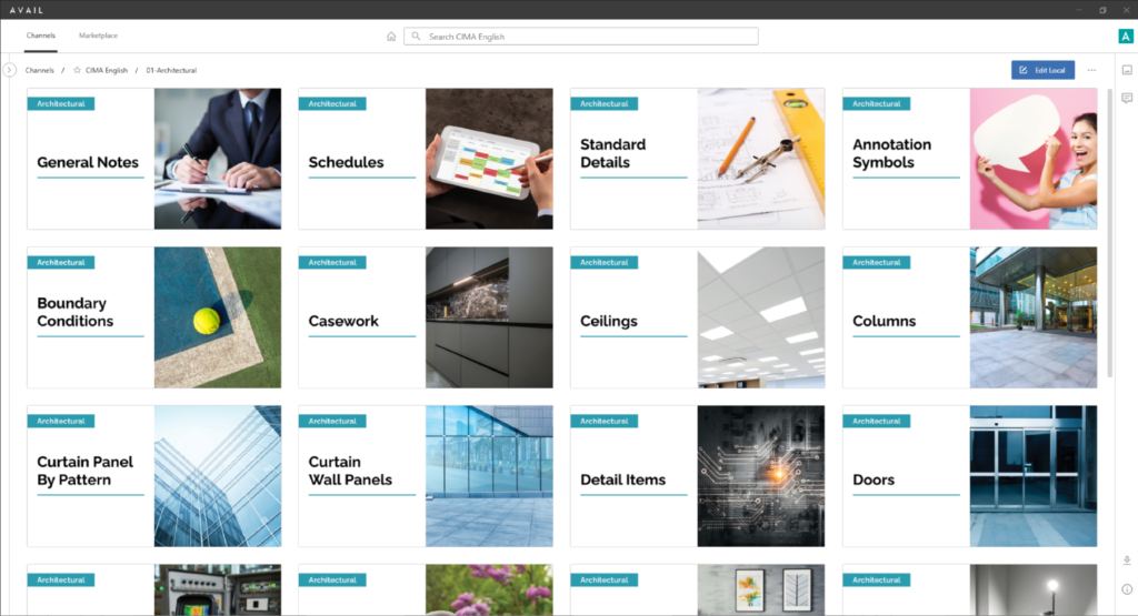
“We wanted to make finding content easier for the user by color coordinating each discipline. Under each discipline the sub-categories match the color of the corresponding discipline. Image attached displays what’s under the English Architectural discipline.”
CIMA +
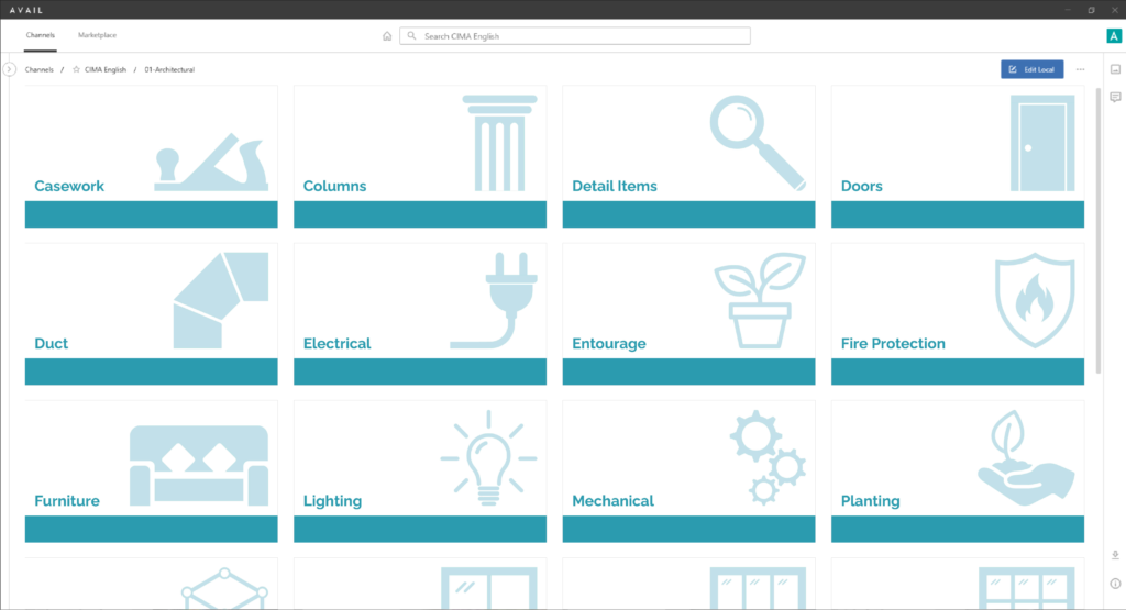
“We wanted to make finding content easier for the user by color coordinating each discipline. Under each discipline the sub-categories match the color of the corresponding discipline. Image attached displays another option using icons instead of lifestyle images.”
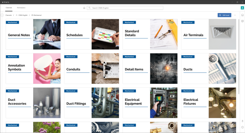
CIMA +
“We wanted to make finding content easier for the user by color coordinating each discipline. Under each discipline the sub-categories match the color of the corresponding discipline. Image attached displays what’s under the English Mechanical discipline.”
MOST CREATIVE
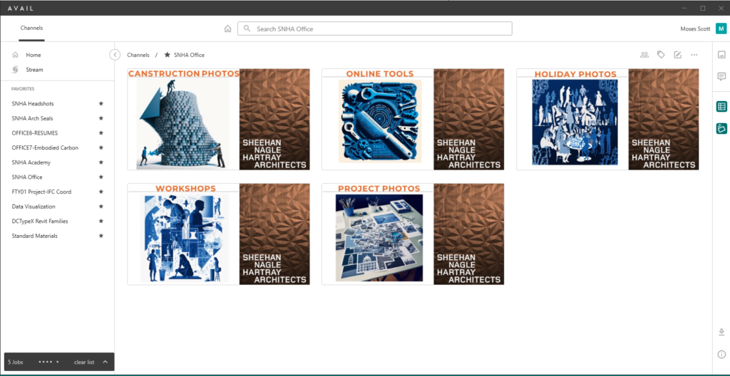
For our last category, we asked our customers to show and tell us some creative things that they’re doing with Key Cards and Channel Cards. The winner of this category was SNHA.
Sheehan Nagle Hartray Architects
“For the Key Card contest submission, I used Midjourney to create Avail channel cards that showcased our Canstruction Project Photos, online tools, Holiday Photos, Workshops, and Project Photos. Using Midjourney, I customized our office-wide template with my own images and text related to these topics, creating a cohesive and visually appealing design. I also ensured that the channel cards had a consistent theme and color scheme, using a font style that reflected the SNHA brand and the tone of my content.
IMEG
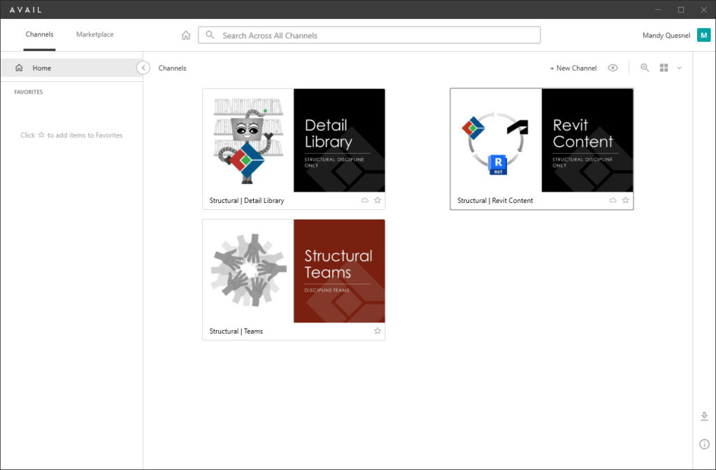
“At IMEG, we are introducing our new friend Gemi (Gem-ee), to help us all have fun with AVAIL. Gemi is showing off our Detail Library while sporting our IMEG logo. No need for a library of books, because we have AVAIL. Our Revit Content shows an image that helps the consumer understand what content is included in this channel. The Structural Teams channel incorporates our entire discipline with all hands in. Go Team IMEG!!”
The 2024 Show Your Cards contest has ended
See 2024 WinnersNeed a Key Card refresh?
The AVAIL content management system enables project teams and enterprises to better find, organize, and manage all of their digital assets. AVAIL is designed to work with your existing file storage systems including cloud-hosted content in solutions such as OneDrive and Autodesk BIM360! With AVAIL’s focus on visuals, information navigation in the AEC industry has never been easier.
AVAIL’s Channel Card and Key Card features provide visual gateways to your content that help you find the right content in just a few button clicks. They’re completely customizable, letting you make AVAIL feel like your own custom app.
Learn More About Key CardsUser-friendly Channel Navigation – How and Why to Use Key Cards
Creating an easy-to-navigate (and maintain) AVAIL environment is essential to a successful implementation of AVAIL. We will share examples of common ways our customers have leveraged Key Cards, tags, and visuals to make search more efficient and intuitive. Timestamps 0:00 Overview 1:59 What are Key Cards? 5:05 Why Use Key Cards?
In this webinar, we share examples of common ways our customers have leveraged Key Cards, tags, and visuals to make search more efficient and intuitive.

